Which? identity and membership projects
Addressing the customer problems with setup of equipment and services

Project overview
I worked closely with the Product owner of the Which? Membership and Identity products to work on incremental improvements and the strategic roadmap
Online Cancellation
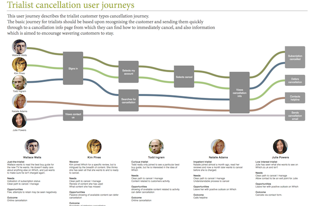
Which? memberships were difficult to cancel online, with most users being directed to use the telephone, or an unreliable email option which often also led to phone interaction. The goal of this project was to create a process and business case for allowing online cancellation of subscriptions.
This project had two main components, creating a reasonable and viable means to allow online cancellation, and to also present that scenario and design to senior managemnt and convince them to follow the plan.
I worked closely with the product owner to design a plan which would see the most loyal customers enticed back, but would leave those who were adamant about cancelling feeling positively about Which? and more likely to return.
Signup redesign and MVT
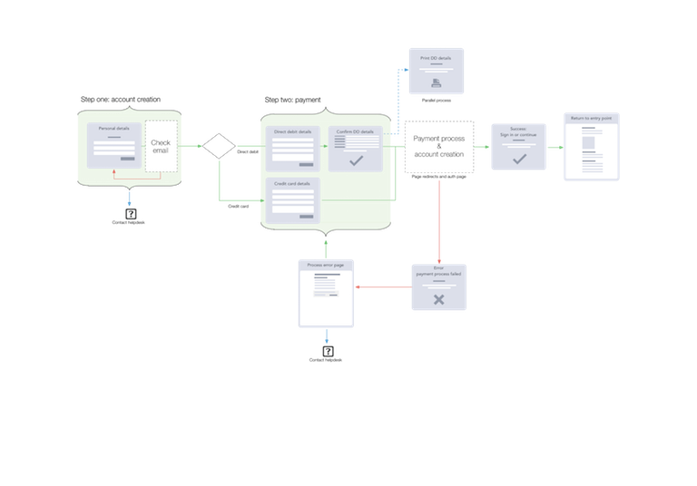
A change in legislation required the addition of some legal copy to remain fully compliant. We wanted to update the design of the signup process to make sure any drop in conversion due to the compliance text was offset by improvements in the overall design. This included making sure the sign up was fully responsive and worked on smaller screens.

We also took the opportunity to streamline many backend processes, and I worked closely with our BA and development teams to fix a poorly operating account creation and payment model. We also took the opportunity to fix other minor aspects like address finders, inline error checking, and other best practices for forms. We also worked closely with other Which? UX designers in creating a Styleguide for the family of sites.
Overall our designs were successful with the MVT tests showing that our design improvements increased conversion by around 13%. Offsetting the 7% drop from the addition of the compliance text. Further design improvements, of the mobile journey especially were also designed intended to be implemented as development resources became available.
Results
The new design met and exceeded stakeholder requirements and was successful upon launch.
Tools used
- Pencil sketches
- MVT, usability testing
- Omnigraffle
- HTML prototyping


